
At Watershed, the Climate Leads we support always come first. For Earth Day, I wanted to make something delightful to help celebrate their progress in decarbonizing their organizations.
For Earth Day last year, alongside a video celebrating Climate Leads, we helped our climate leads distribute an emissions summary report to employees at their companies. However, it wasn’t consumable e.g. on Slack as a drive-by viewer: you’d have to log in with SSO and digest a fairly detailed report.
This year, I proposed redesigning that report to be more comprehensible, but a multi-week project couldn’t fit alongside our current workstreams. My wonderful manager Jackson pushed me: could I focus on the essence, and come up with something to delight customers in the week before Earth Day?
We’d previously thrown around the idea of a “Spotify Wrapped for your climate program,” and cutting the scope down from a full climate program report to something bite-sized & shareable seemed promisingly possible. I made quick sketches on my iPad of what could look like to see if there was a one-week version that might make sense.
Not heeding Jackson’s suggestion to avoid tackling a larger project than I could finish, I wrote up a document describing the project idea and decided to run with it.
Monday (one week from launch)
Monday morning, I talked to our product team lead about the idea, and he gave the clear for a designer & engineer to join this effort for the week. Since this wasn’t the only project on my plate that week, the additional firepower from Kristin (product designer) & Sheila (product engineer) made the project feel more achievable.
We kicked off with a discussion on what we were imagining & the intended audience. Many Climate Leads had significant plans in place for Earth Day, announcing progress reports & new initiatives. We decided to design for Climate Leads without major plans yet in place, and to target sharing inside the company (versus on social media), since internal announcements would be an easier ask on short notice, and reduce the need for customization companies might want for a public announcement (e.g. adding their logo). While doing more thorough user research & thinking would’ve resulted in a better product, with 4 days to build, we took an opinionated guess.
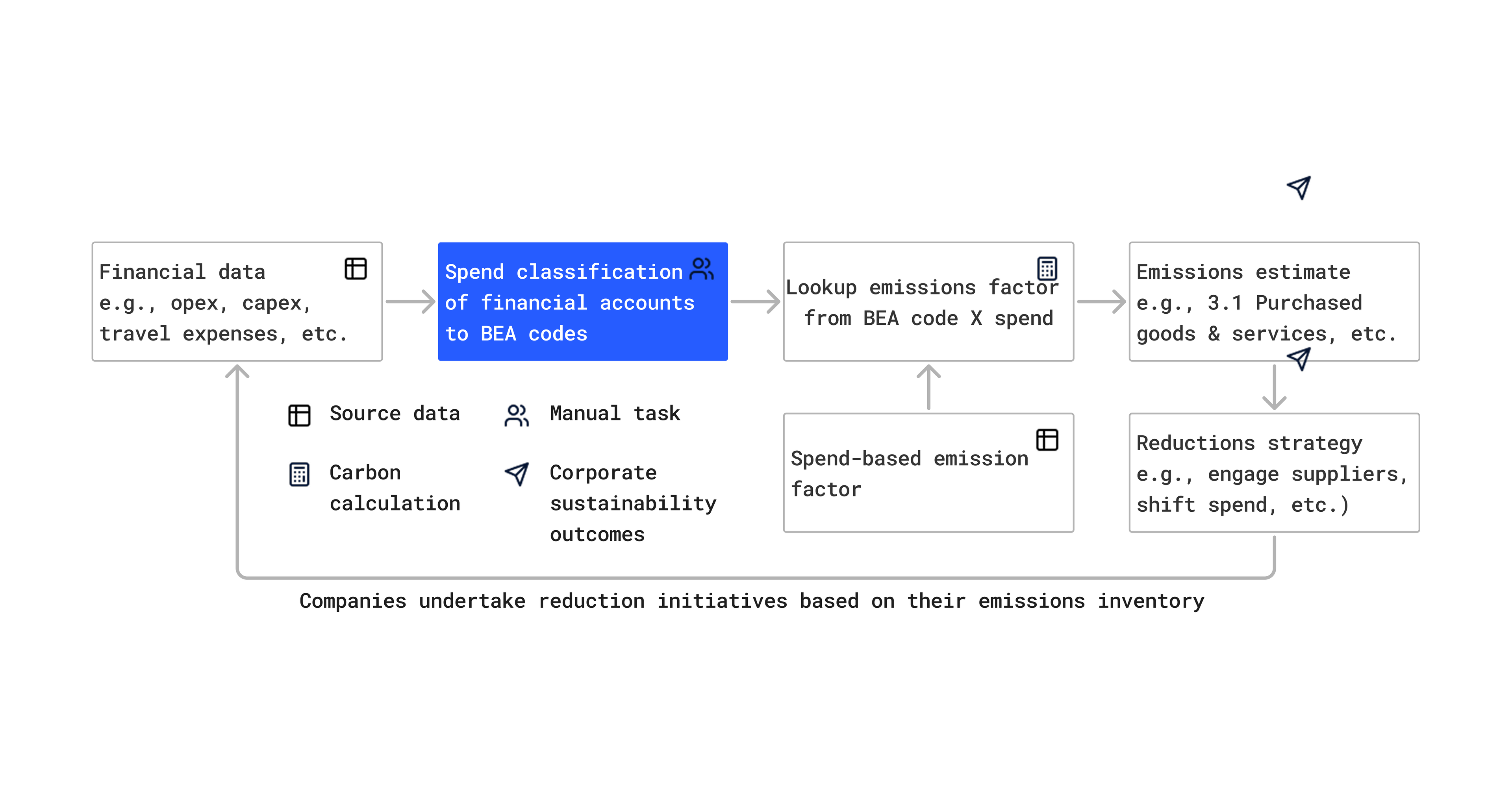
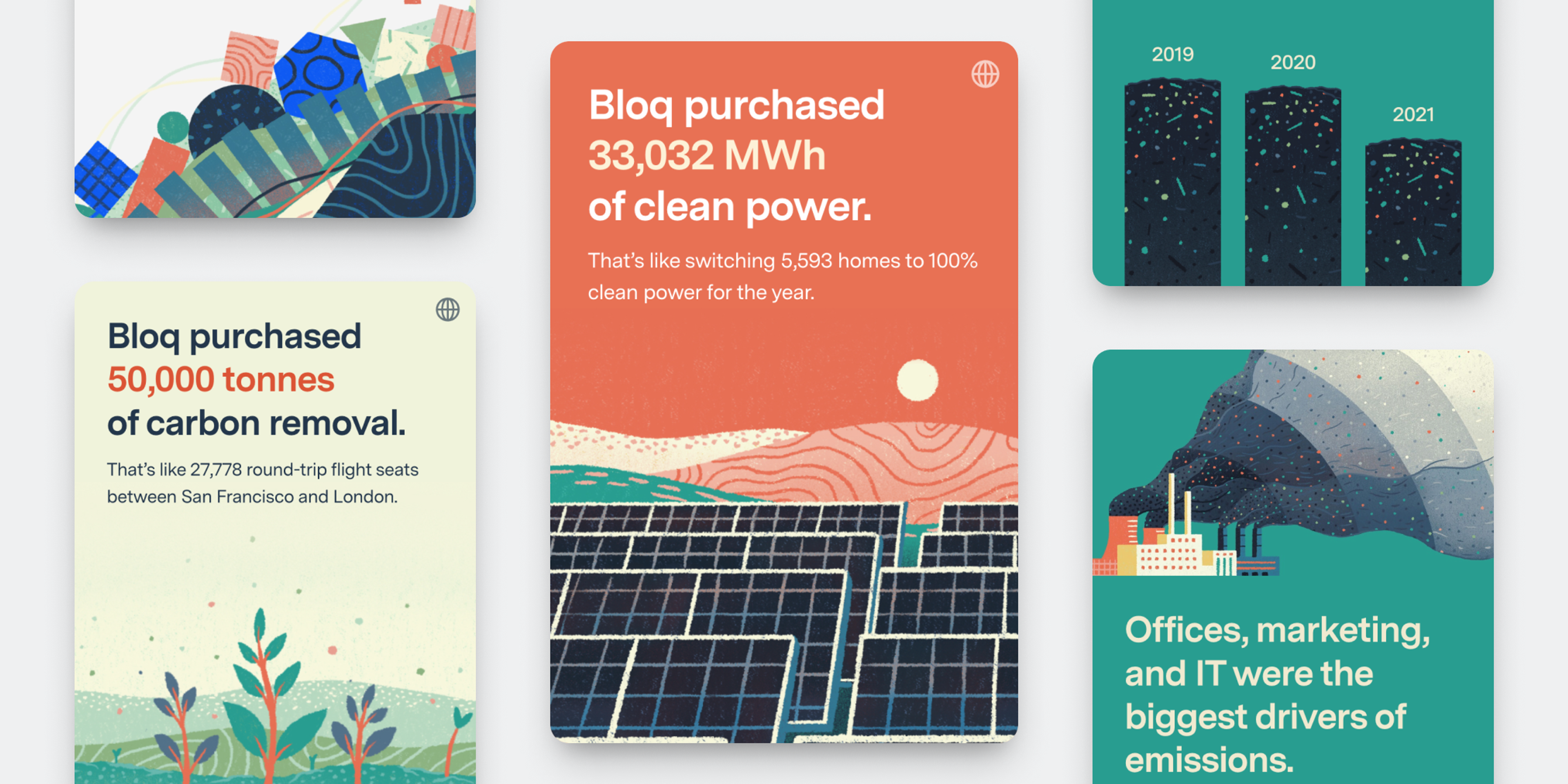
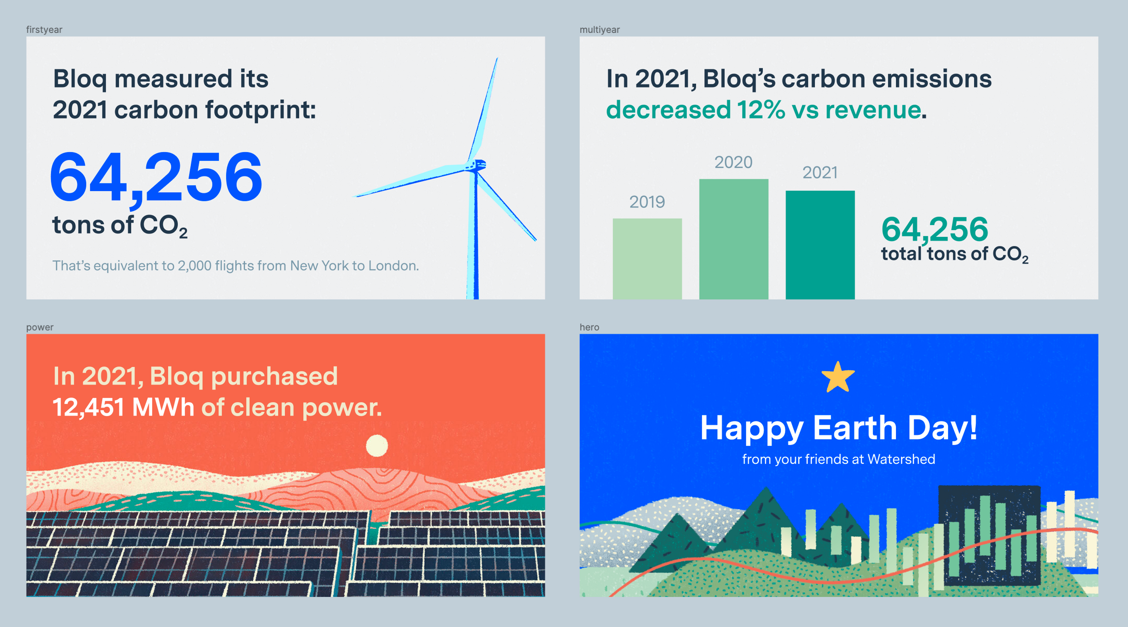
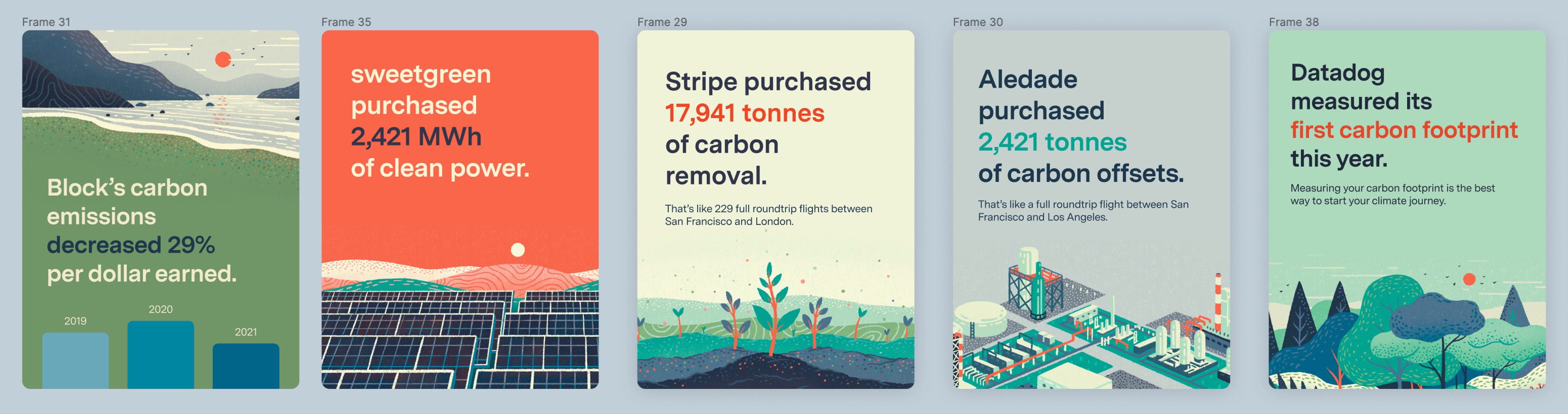
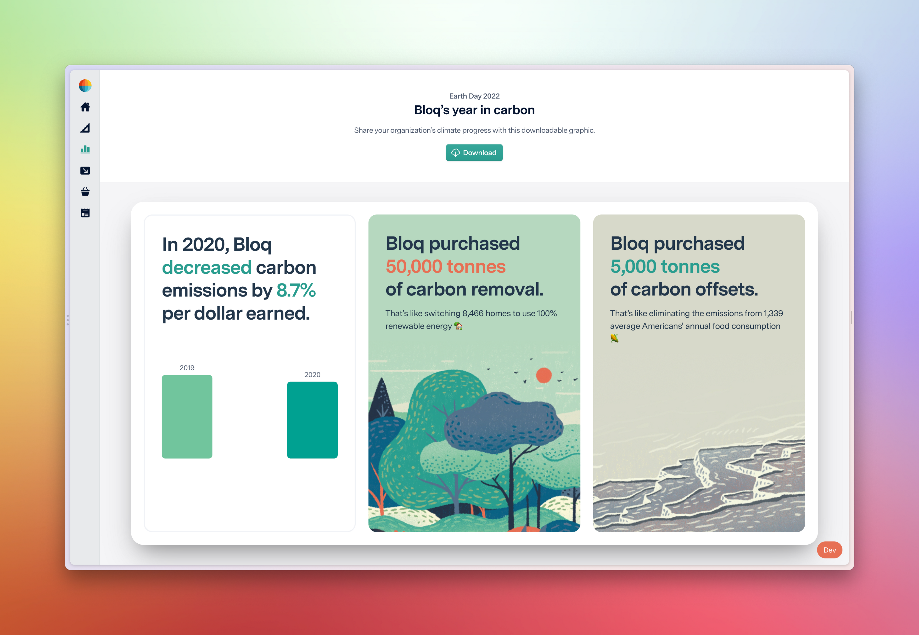
We wanted to build a tool that presented climate program milestones on beautiful cards, which a Climate Lead could export as a graphic to share on Slack or email with their company. Quickly auditing the many visualizations of emissions/action Watershed offers across the product, we narrowed it down to 4 key summaries: the amount emissions have decreased, carbon offsets purchased, carbon removal purchased, and clean power purchased.
With the vaguest structure in place, I jumped into code, starting to wrangle live data into these modules. I set an early technical constraint for myself to use existing data structures and only write new code for the UI, keeping the build simpler.
Tuesday
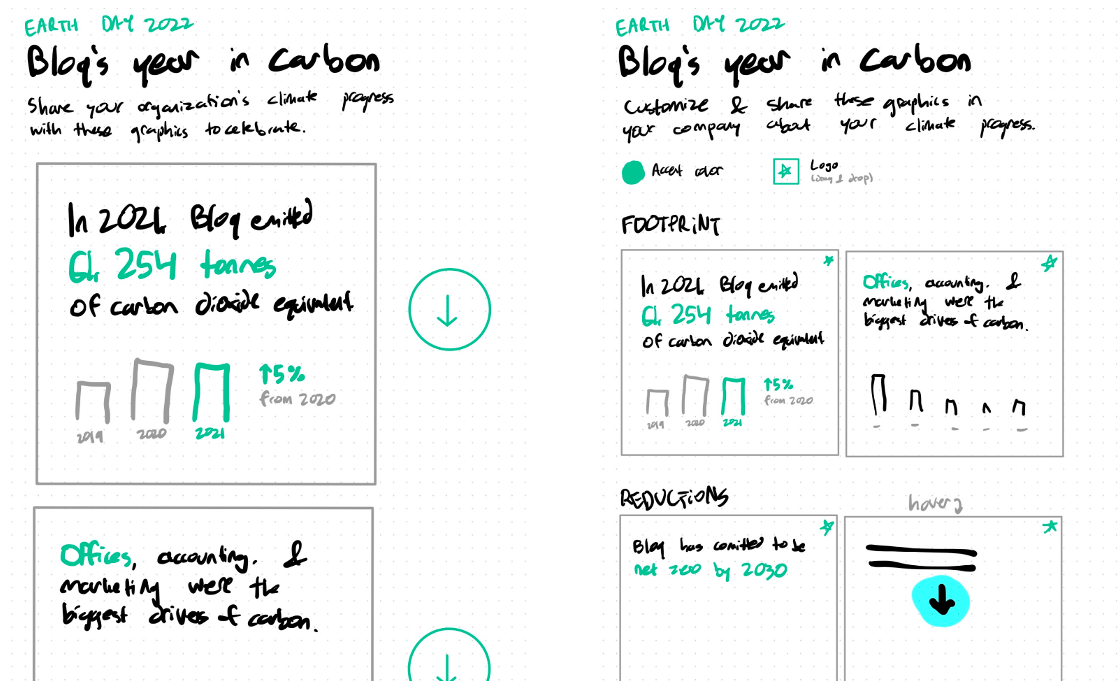
Kristin sketched early wireframes, based around the idea of “stack ranking” various accomplishments on Watershed and presenting the most compelling one.
At the same time, I explored the visual style. I spent 20 minutes on potential visual directions for the cards, incorporating elements from our brand illustrations.
Kristin & I brought the sketches to design critique, our twice-a-week convening of the design team at Watershed (6 members, as of this week) to discuss in-progress work. One designer suggested that when sharing on Slack or email, dealing with separate downloads for each graphic might cause added friction; instead, the tool could construct a single graphic with several panes.
We landed on portrait-oriented cards stacked horizontally, as we could add any number of cards depending on the company’s progress. I resized the style explorations into portrait cards to test in Slack, and the thumbnail looked decent:
With this visual prototype feeling right, I dragged the cards’ CSS styling into this portrait-stack shape. Working on the code simultaneously with the designs continuously de-risked the project, as we weren’t imagining anything we weren’t testing in code within an hour, validating every step would be possible in our timeframe.
Wednesday
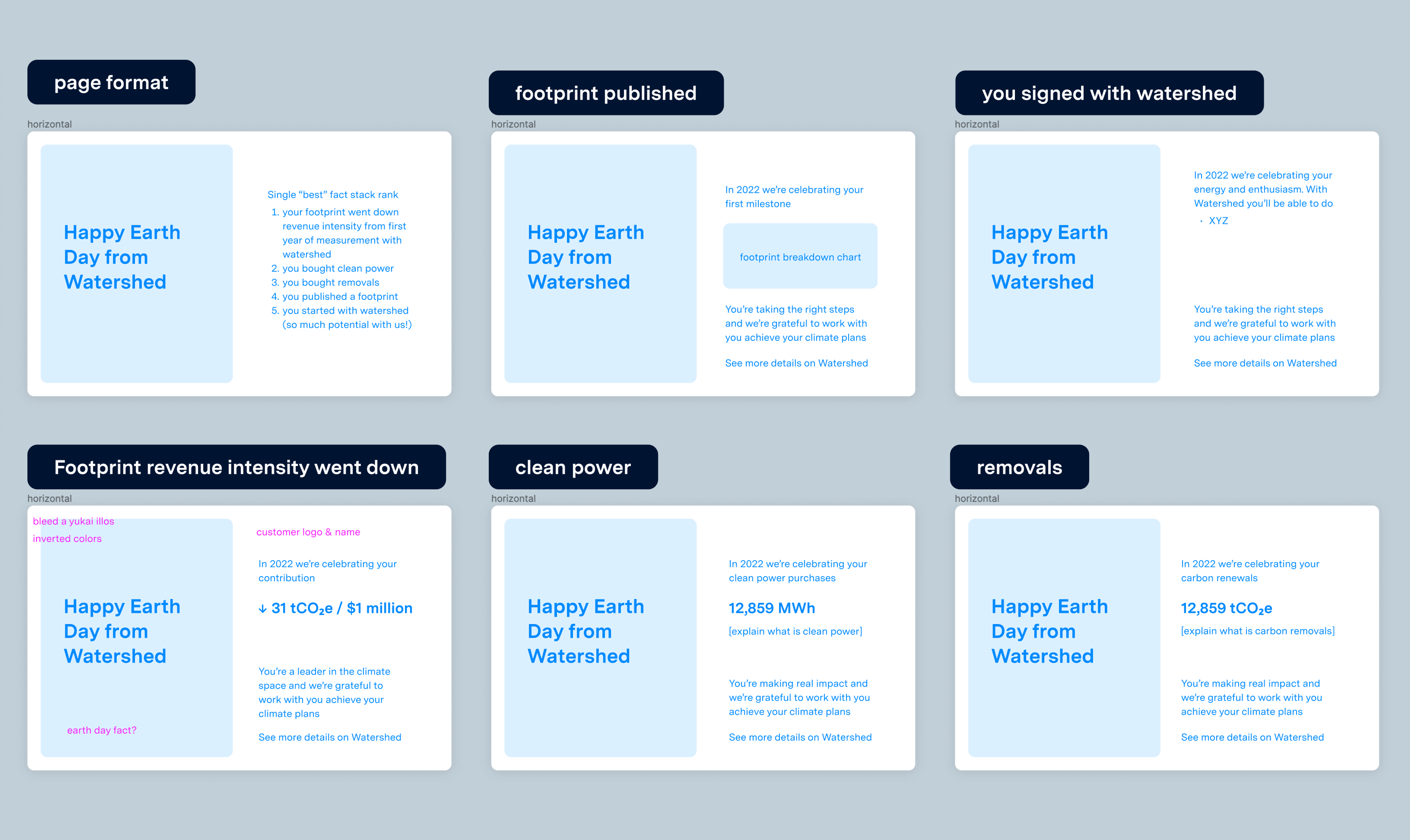
Wednesday was our design-iteration day. Kristin hammered all day, trying many combinations of illustration, color treatment, & copy:
One design challenge we encountered was units. In our dashboard, many numbers are presented in “tCO2e,” which means metric tons of all the greenhouse gases an activity produces, measured in the unit of carbon dioxide’s climate-warming impact. While that’s already a complicated metric to communicate to passerby, our emissions card would show tCO2e divided by revenue, which lets you evaluate if your emissions are growing or shrinking relative to your business growth. (E.g. if you doubled your products sold in one year, it’d be challenging to reduce absolute emissions that year. But if you divide by revenue, you can see if your business is becoming more carbon efficient.)
We decided to show tonnes of carbon removal/offsets purchased but omit the company’s total footprint number, and landed on the phrasing “emissions decreased N% per dollar earned.” While not perfect—such as for European customers who don’t use dollars—it was comprehensible by anyone without including a paragraph explaining tCO2e / $1M revenue.
Sheila built the processing of footprint data into the relative emissions vs revenue for each year, and assembled a chart of it, while I worked on building the UI of the tool.
Thursday
Kristin kept iterating on the cards, improving our copywriting & bringing the illustrations to life. She had an amazing visual idea to perk up the emissions bar chart beyond colored rectangles, using stacks of “carbon.” After struggling with SVG effects to implement this in code, I switched to CSS flexboxes to get it done.
For design crit on Thursday, Kristin & I brought our Figma docs & screenshared our progress. We got a litany of helpful feedback: improving color contrast, adding a real-world equivalent example to our clean power card to make MWh more comprehensible, optimizing the design for simpler downloading. While I’d been designing around the graphic being a singular element on the page, on our way out, Jackson made a quick sketch on the whiteboard of breaking the cards out on the page to perk up the layout.
In this case, it took less than half an hour to implement Jackson’s layout suggestion—hiding the directly-exporting graphic from the page, then rendering the same React card components with a different layout—but I wouldn’t have considered the idea on my own.
Testing our tool with different customers’ data, Sheila & I found dozens of edge cases & bugs to fix. We had to be judicious about which to prioritize with such a compressed timeline, but we kept a shortlist of ideas to try building nonetheless.
One of those ideas Sheila added was customers being able to choose which cards were included in the graphic: limited customization without venturing into building a full-on design tool.
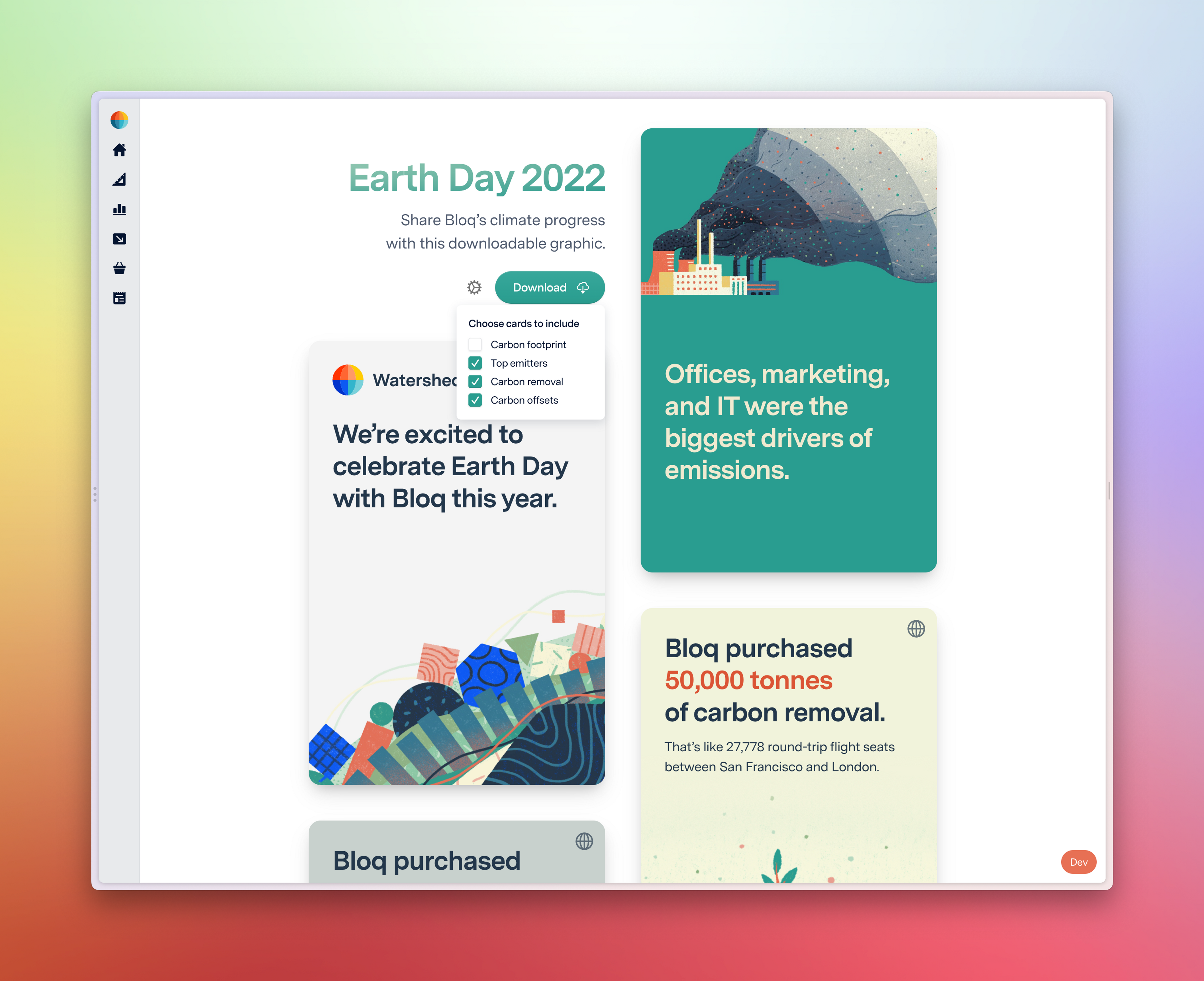
I wanted a card summarizing which categories of business activity produce the most carbon. I gave myself half an hour to see if I could built it at suitable quality, knowing we could ship without it. Whereas many cards relied on specific activities a lower percentage of customers have taken so far, such as having purchased carbon removal, it was gratifying to add a card that nearly all our customers would see.
Friday (last day of development)
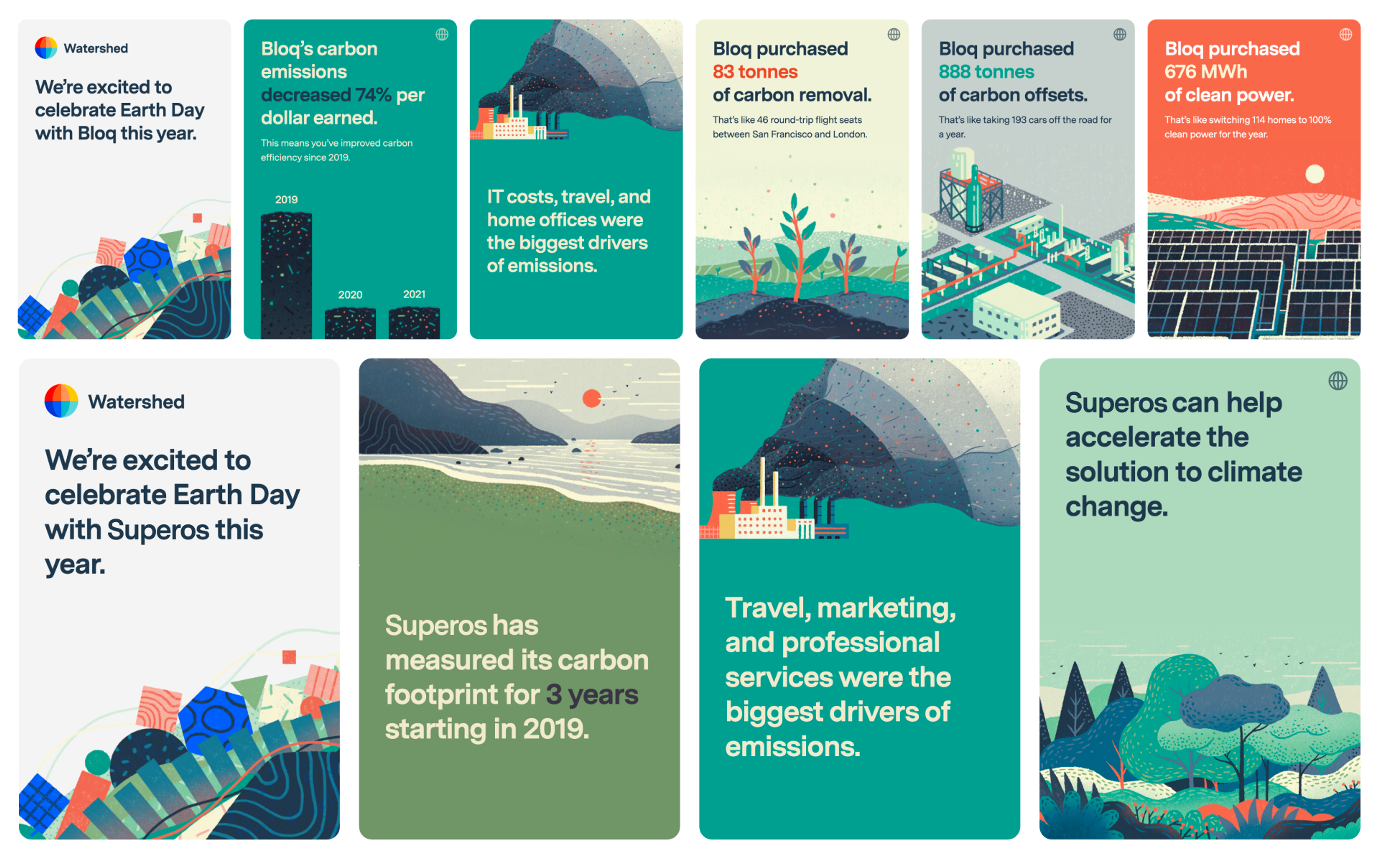
Friday morning I demoed our project to the rest of the Watershed team, a reliably exciting milestone. While the project felt nearly ready to go, continuing to test the tool & show it to more team members brought in reams of helpful feedback. We spent Friday polishing everything, stress-testing the automatic summary generation across customer data & implementing Kristin’s final design suggestions. We ended with 8 card designs, each dynamically embedding data about the company’s climate program.
Victoria, one of our amazing Climate Stategy Managers who work 1-on-1 with customers, graciously volunteered to manage communicating the tool to customers. We drafted emails, and she made a Notion database tracking every customer and whether they were using the tool.
Monday, launch day & first day of Earth Week
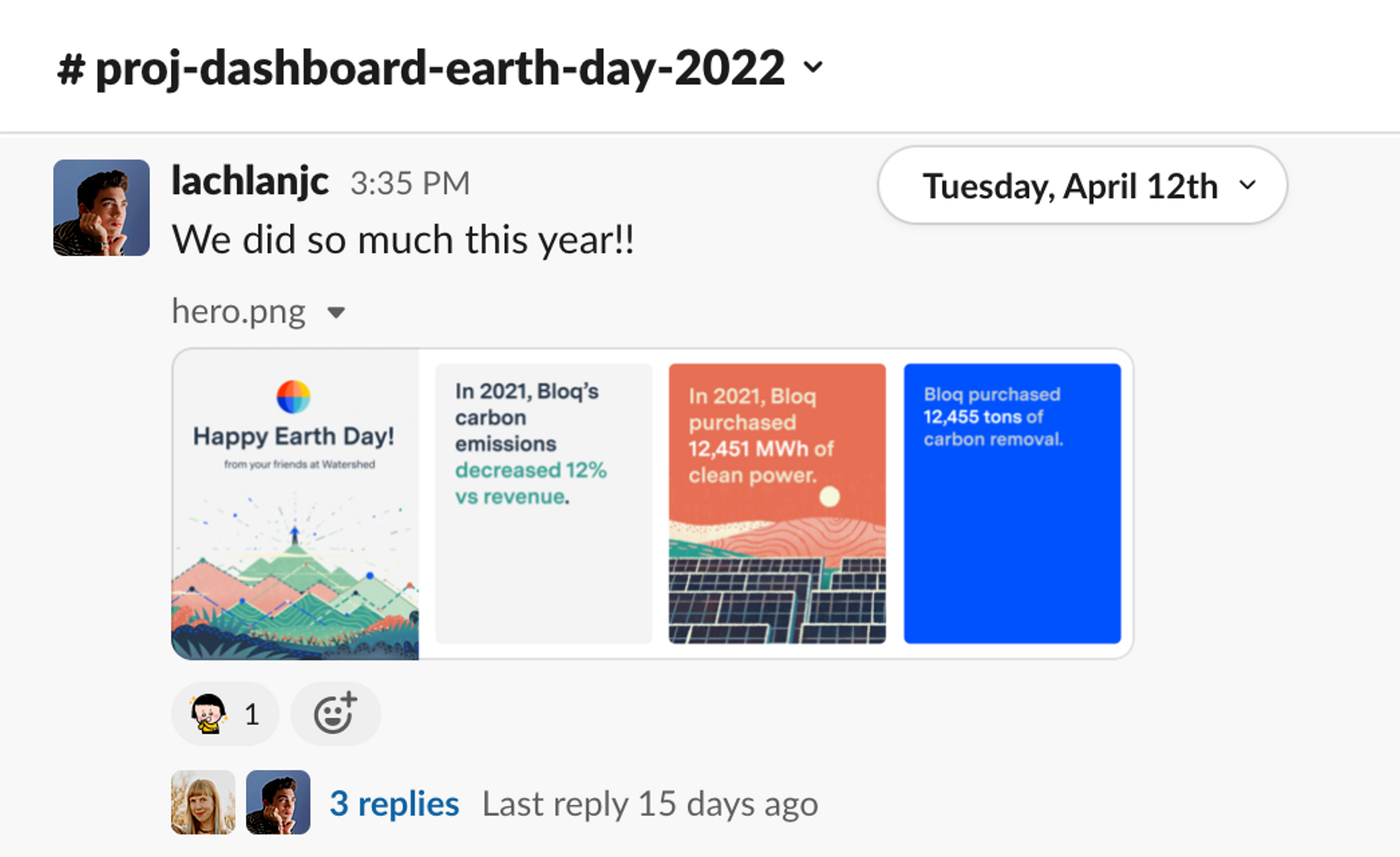
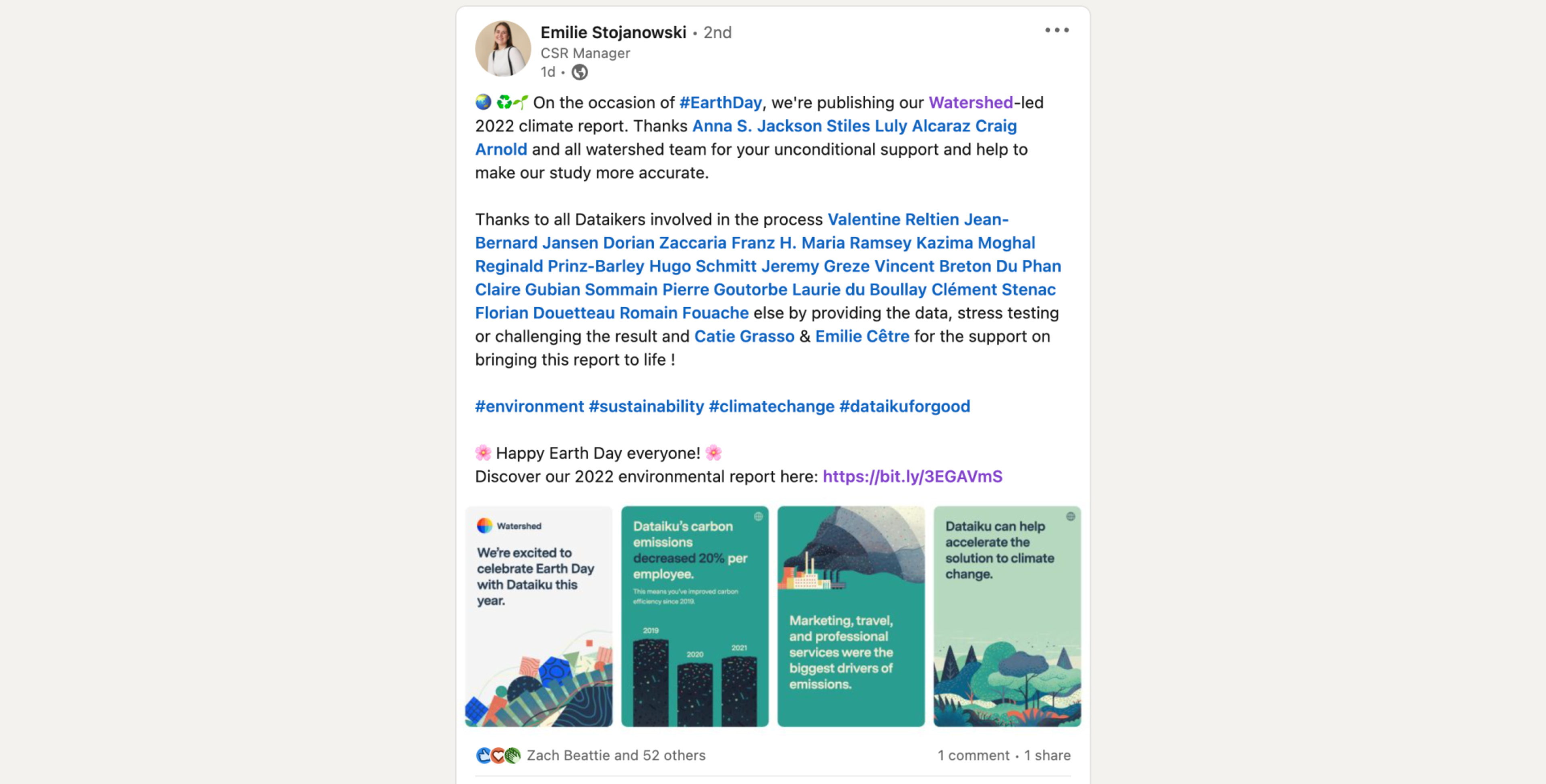
After we announced the tool, a wide array of customers let us know they were incorporating the graphics into their Earth Day celebration. The graphics ended up in Slack channels, company-wide newsletters, slide decks in all-hands meetings, on LinkedIn, and even on the desk of the board chairman, who forwarded more questions about the carbon footprint.
For a project built out over four days, it was a success! If we’d started earlier in the year & spent longer talking to customers/planning, we likely could have leveled up both the resulting product and the impact of its usage. A number of Climate Leads mentioned they’d have loved to use the graphic, but didn’t have time within the week to share the news. Some factors will always remain outside the realm of control of a web app.
On Earth Day & every day, we strive to use great design & product thinking to help catalyze a wide array of climate programs at all stages, from their first footprint measurement to large-scale carbon removal contracts. It’s a massive privilege—and if you want to join us, we’re hiring engineers & designers!